domingo, 26 de abril de 2015

UNHATE by Benetton

The tecnics of Benetton to call people atention are so popular because they had been doing advertising for 90 years.
Images that we wouldn’t imagine appeared in November of 2011 from Benetton’s Brand. This campaing is remembered by everyone because it produced an impact in communication medias. A lot of journalists commented this fact and people talked a lot about it in social networks.
The main issue of this campaing was inviting, especially inviting the leaders and people of the world to combat hatred. The way that they decided to transmit us this concept was the kisses, the kisses between historic rivals.
With the slogan “Unhate”, Benetton wanted to send us a message to stop the hate. The Brand said that “they invite us to consider that love and hate are not as far as we thought”, Farewell to hate and to that culture.
The pictures were shown in this campaing were so shocking:

First, Pope Benedicto XVI with Ahmed Mohamed, el-Tayeb to the Al-Azhar mosque in El Cairo. It was hanging in the Sant’Angelo bridge in Roma, near Vaticano.
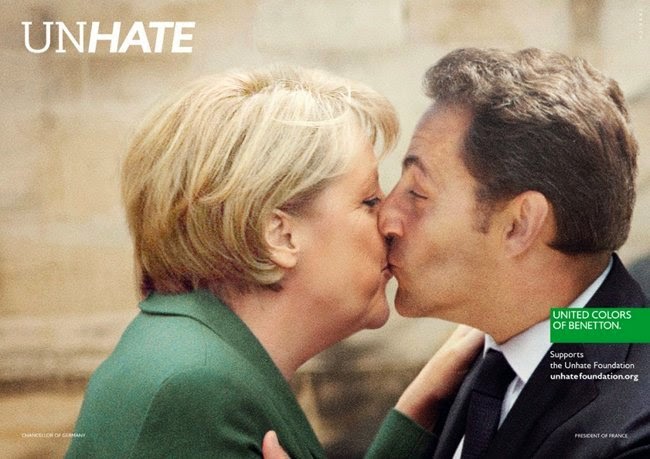


In other images we can see the German Chancellor, Angela Merkel and the President of French Republic, Nicolas Sarkozky kissing themselves. This people was choosen because their countries had had a lot of conflicts between them in the past.

The next picture shows Mohmoud Abbas, the President of Palestine, whit Benjamin Netanyahu, First Minister of Israel, two countries in constant war. All these rival leaders for always were kissing fictitiusly for Benetton.

In the following photo, we can see The Leader of North Korea, Kim Jong-II kissing with South Korean President Lee Myung-Bak, two countries that have a lot of conflictes and hate between them.


Barack Obama is the character more pictured. First, he was pictured with the President of the People’s Republic of China, Hu Jintao and, then, with the President of Venezuela, Hugo Chavez. However, people expected that he appeared with our former King, Juan Carlos I, due to their famous argument.


These pictures were also accompanied by a video shared on social networks in order to represent the main objective of the campaing.
Benetton opted for this idea to call attention in this occasion of crisis in which it is necessary to the image of the brand.

Pictures were staged but he most commented was the image of Pope I. The Vatican protested beacuse it considered “a serious lack of respect” and Benetton had withdraw such image. But they insisted that the meaning of their campaing was exclusively combating the culture of hatred in any way and they regreted the use of the pontiff image and hurt faithfull sensibilities.
For many years the clothing Brand has opted to turn the world upside down and create controversial campaings of those who put this finge ron the sore and shaking the prosperous society. But some years before this campain they didn’t create advertising as striking as this. Is for it and for their economic losses that they decided to launch it.
The Benetton advertising campaing titled Unhate, translated as “anti-hate”, represents an ambitious, but realistic, goal of the textil group.

Cristina Plano Anadón

viernes, 24 de abril de 2015

Apple

1984, the year of Apple, when he began to write his great history

This ad was first broadcast on January 22, 1984 during the rest of the third quarter of the SuperbowlXVIII in the United States. It was directed by Briton Sir Ridley Scott. 

The commercial showed a nameless heroine (interpreted by Anya Major) wearing red shoes, red shorts and awhite top.


An apple and a computer appears In the picture, the girl appears running with a hammer through many people sitting in armchairs to a screen with the image of "Big Brother" interpreted by David Graham. 

Heroin stops in front of the screen, turned on itself and threw the hammer in to the screen, making it explode.It then appears on the screen the voice of Edward Grover message: 

On January 24th, Apple Computer will introduce Macintosh. And you'll see why 1984 won't be like "1984" . At the end we see a picture of the Apple, a rainbow-apple logo on black background. 

He was a millionaire ad: $750,000 only for filming. . It was filmed in London. Jobs commissioned a TV ad that would be so revolutionary and surprising as the product they created. The advertising agency that did work was Chiat / Day and its creative director Lee Clow was. 

This announcement was seen by 96 million people. That night the principal television channels and radio were not stopping speaking about it. 

“The concept I wanted to reflect the rebellious spirit of the time” Jobs. 

This announcement was issued in full only once, lasted 60 seconds (Super Bowl), had such good results and caused so much excitement that began issuing smaller versions of 30 seconds. 

The sales target was 50,000 units and only the first 100 days were sold over 72,000 and if there were more sales was for a production issue ... 
The commercial is placed on top in surveys of the most influential advertising campaigns. 

This advertisement changed the Super Bowl. This event annual would be for the sector of the advertising.


1984 is considered a reference in advertising. Apple competes with the leader in the sector, IBM. The symbolism of the ad is clear: Big Brother representing IBM and Apple model..It had a very high position in the market. It was an expensive brand, It and had a monopoly on computers and technology. Apple tries to fight this brand. But now it is already above all. The roles have changed, now Apple has become IBM. 

Advertising Apple changed over the years. At first I wanted to be innovative, colourfulness and worldwide. 

At present Apple is a brand with high prices, not everyone can buy it. He wanted to be explusive, with design and making his mark prestige in society. 

Apple after the ad of 1984, continued to sell new products. And the brand continued to make history with each new ad. 

He returned to have great prestige with the Iphone and takes with all its editions until today, six.


“It is better to be a pirate than join the Navy” Steve Jobs 

 MARÍA GIMENO MARTÍN

BMW "¿Te gusta conducir?" ("Do you like to drive?")

BMW

If we talk about the most important and revolutionary advertising campaigns of history, we can’t forget that which the renowned automobile brand BMW carried out from the hand of the SCPF agency.
As we can see on the spot, throughout all the video only appears and takes the role of unifying thread a hand that sticks out the window of the driver of a car while it’s doing light movements and playing with the wind. At the end of the ad, a sign reveals to us to which brand belongs this commercial spot to. And the thing that was most important at the time, what kind of product was advertising, considering that we don’t even see a car in itself, nor its silhouette, we simply see a hand that show us how a person enjoys driving its car, its BMW. It was a great novelty, it was the first commercial ad in which it didn’t appear any car!

At first sight, the spot may seem extremely simple, but if we analyse it in a deeper way, we can see behind all the complex production and development of the campaign and the importance and originality of its meaning. This, together with the breach with the typical way of advertising automobiles, explains that success. Success that has endowed with great personality the brand.
60's advertising poster
Around the 90s, BMW constitutes itself as a brand of high-end vehicles and coldly technological. That’s the way was perceived by the public, as a distant and impersonal brand. Clearly, the image that had the mark was a reflection of the communication that was carrying out up at the time. This advertising campaign, in addition to changing and improving the image of the brand, it completely changed the way to advertising cars and thereof conception, because until then, all the advertising actions that we knew about this kind of product was based only on describing the characteristics’ car and the technological advances that it offered. 
And it’s thanks to this sort of communication that BMW has become in an example of Spanish advertising. This campaign brought, together with the turn of the century, stopping focusing on the magnificent features and news of the cars, to talk about the feelings that they convey us when we use them and also show us what they can provide us, representing unique sensations of driving, in which the most important thing is the driver and his emotional connection with these machines of latest fashion in technology. Of course, in those days, it was thought impossible a spot of a car without the car appearing in the ad. BMW has demonstrated that in addition to be possible, it is effective.
Chosen as the best ad of the last 25 years in the Latin American Festival of Advertising Communication El Sol, few advertisements have been know transmitted so exactly the feeling of enjoying  driving.
Its claim: “¿Do you like to drive?” it’s the result of a communication strategy that perfectly defines its spirit. This, and no other, it’s the sentence which makes the brand connect emotionally with its audience. And that is precisely the target of this firm: people who love driving and who enjoy doing it.
In short, BMW is considered, according to different studies, the brand with the best worldwide reputation in recent years, the most valuable automobile brand in the world the year 2012, the signing of cars with the highest number of fans on Facebook and the automobile premium brand best selling at world level. Many would say that it’s coincidence, but… Do you still believe that communication is something secondary?

MARTA IBÁÑEZ PÉREZ

Referencias:

Coca Cola Company

The spot that I will discuss is a spot produced by the McCann Erickson advertising agency for the Coca Cola Company in 2009. 

This advertisement analysed to a minimum is an advertisement which aims to announce a refreshing drink Coca Cola. It was released in audiovisual media such as television and the internet and has a duration of 1 minute 32 seconds. 

Now I will analyze the spot telling what appears on this. The spot begins with a copy where you can read the intention of this and that is that, in times of crisis, Coca Cola brings together the older man and the youngest baby in the world. Coming up next we can see a pregnant woman, pretty nervous, because as indicate this time the spot, missing three hours to give birth. The woman’s belly, that is to say, the baby is presented as Aitana Martínez. In the backplane we see an older man who just then begins to tell a presentation of him to Aitana. He begins by saying that is called Josep Mascaró and is 102 years old. The following comment is the luck to have had be born, and therefore fortunate to have met his wife and his friends. Tells her that he will go to visit her to the hospital because many people will tell her that is a madness be born into a world with such crises, but he wants say to her that in the end all she will remember will be good times. By this he wants to advise her to enjoy every moment that makes she happy. While these words are heard, we can see that the man meets the little newborn. The last seconds of the video are shown to us several moments lived by Josep, but he still speaking to Aitana saying: “the only thing you will not like of the life is that it will seem very short”, and ending with the campaign slogan: “You are here to be happy”. 

For this spot, Coca Cola continues with its emotional line with which has accustomed us over several years under the slogan: “Open happiness”. Besides advertise a product, the spot tries to give pause and especially thrill the audience. In this way can get closer the values of the brand with consumers. The brand is not presented until the end of the spot because it does not seek an outright sale but spread its values. When we consume this brand, we consume what it conveys; its values and experiences lived through the brand. In all the videos that encompasses this slogan, Coca Cola has scrounged a powerful intangible face of its competition, and it is the concept of “happiness”. Happiness is subjective to each person, and can have infinite definitions, but trough “Open happiness” wants to group all these definitions that can be given, under his name or brand. This is to ensure that all people think in Coca Cola as a synonym for happiness. Always try to relate their advertisements with situations that we can be identified easily identified as close to us. In this way, it is doing us feel part of the brand and, again, make use of the emotional and not rational. 


Now I’m going to focus on the repercussions of this particular ad. Was very successful because it came at a moment when people were very worried and pessimistic due to the economic crisis. It managed to move the population with their own experiences of the lead actor, implying that this might not be one of the best moments in history, but he has lived through worse times and in the end, the only thing that he remember are the good times. In the second part, where the newborn has more prominence, Josep speaks of the importance of seizing the moments that make you happy. 


LORENA CARLA ANDREI 


Referencias:


CHANEL Nº5

Coco Chanel
Chanel is a fashion brand that was born in Paris in 1910. Its official designer is Coco Chanel and she specializes in luxury articles like haute couture clothes, hand bags, perfumes and cosmetics. Coco Chanel was a daring and revolutionary woman of that age. She was a creative trend setter who introduced very innovative designs.

 Perfume
But now we are going to talk about her advertisements. Especially we are going to talk about a TV ad that has caused a lot of impact in the media and of course in general society. It was created in 2004, and the product of this commercial was the Chanel No.5 perfume. The artistic director of the company, Jacques Helleu, had specifically asked Baz Luhrmann, director of Moulin Rouge and Romeo and Juliet, to do this spot. Baz Luhrmann follows his own over- the-top and theatrical cinematic aesthetics, and it seems that we are watching a spin off of the Moulin Rouge movie. Obviously, the ad has two versions, one for TV, and another for cinema, which was longer than the first one and was about four minutes long.

The main actress (in Moulin Rouge) was Nicole Kidman, who characterized Marilyn Monroe. In the movie she is a famous person and is being chased by paparazzi, meanwhile she falls in love with a writer and they live a romantic and fleeting adventure. In the ad, she disappears from this world one night because she wants to forget the pressure of being famous for a while. She gets into a taxi to escape from the paparazzi and here she meets the man who will star in the romantic story of the ad.

But the principal reason for choosing this spot as one of the most important in the history of advertising is its budget. The video of Nicole Kidman was one of the most expensive in the world. The ad cost 33 million dollars. The first time it was shown was in 2004 in the leading cinemas of the EEUU, on the first of November. A few days later the ad was aired on TV. Moreover, Nicole Kidman was the best paid actress of commercials in the world, with 3.71 million dollars, which is the same as 928.800 dollars per minute.

Apart from this ad, Chanel has done more advertisement campaigns where the main actresses were Coco Chanel, Catherine Deneuve, Ali McGraw, Candice Bergen and Carole Bouquet. But Marilyn Monroe was her best brand ambassador.

Marilyn Monroe
Marilyn Monroe was an icon of the era, the sensuality queen and an artistic myth. The most famous incident was in 1955, when Chanel No.5 was the most famous and recognized perfume in the world, a journalist asked her what she wore to bed. Immediately she answered, “Only a few drops of Chanel No.5”. Many years later, in 2004, another big star of Hollywood took the lead role. Nicole Kidman, the Australian actress who was chosen because of her exceptional smartness and her ability to transmit the spirit of modernity of Chanel.  She was born on June 20, 1967 and has been featured in a lot of movies. This fact has given her the opportunity to win an Oscar, 2 Golden Globes and a Bafta. So this proves that today, Nicole Kidman is one of the most important film stars in the world.

As for the filming of this extravagant commercial, we know that Jacques Helleu, artistic director of Chanel, travelled to L.A. to interview N. Kidman for an hour. Nineteen months after this meeting, they started to film the ad in Sidney. The duration of the filming was only five days but in contrast, the preparation of it took up a lot of time. Lots of costume tests in Paris and London. Meetings with all the technical groups and at the same time meetings with the artistic directors responsible for the ad. 
THE SPECIAL DRESSES

Feather dress
In the short film of Chanel No.5 we can see two special dresses that the main actress wore. On one hand, we are going to talk about the dress with pink tulle, embroidered with a cascade of ostrich feathers made, of course, by haute couture Chanel designers. The process of embroidering took about seven hundred hours and more than ten people worked on it. This task required lot of patience and concentration with the unique aim: reach perfection. 


The jewel of Chanel No.5
On the other hand, we will talk about the black dress. It was a velvet dress including a spectacular neckline at the back because Nicole wanted the dress to be very sexy. Also, the company wanted to show the famous necklace with the number five and it was the best option to do that with elegance. This necklace was made with diamonds, valued at 40 million dollars. Three Chanel people travelled to Australia to adjust the special jewelry and off course it was the unique clear reference about the perfume in that ad.


Finally, we know today that this spot is an icon in advertising, not only for perfume campaigns, but also for other merchandise. Many reasons prove that it is true, the way the video is made: the filmic style (slices of movies) or the huge investment that had been necessary to go ahead with the project. For indeed, this advertisement is remembered as the most expensive in the world.

TERESA FACUNDO TARAZONA


Referencias:


lunes, 20 de abril de 2015

PAINT, SONY BRAVIA


Sony Bravia TV


The TV Ads are often too much; they try to bomb us everywhere with all kinds of advertising claims even during our favourites programs or series. However, what happens if we like to see a TV Ad repeatedly?
Paint, Sony Bravia would be an example for me. Why? There are many answers. Now, we are going to try to know thoroughly everything possible about this Ad.
In this Ad appears a block of flats that were to be demolished in Glasgow, Scotland.


Painting firework
These were covered with 70.000 of ecological paint. This Ad was made with the help of more than 1.400 separate explosions at the beginning of the video simulating fireworks, and concluding with a “reverse demolition” of the building. Isn’t it amazing? There is no virtual editing in this Ad, all the elements are real and made only for this Ad. It seems impossible, right?
Here, we can check it in the “Behind the scenes”:


The reverse demolition of painting
The music has a very important role too in this spot because it is a powerful song, performed by an orchestra, which increases the communicative power of the message “Colour like no other”. The theme is La Gazza Ladra of Rossini. The images follow the rhythm of the music, making the Ad a true work of art. I think it is one of those Ads that the viewer watches for pleasure and not interpreting it as a simple noise, but as an attractive artistic creation.
One of the explossions of paint

That is quite an achievement in the world of advertising because when someone sees an ad, in most cases, perceived with a doubting attitude and defensively: know that want to sell something (usually not necessary) and use persuasive techniques to convince or deceive. 

On the other hand, we can find on Internet many points of view about this Ad, so we are going to talk about one of them.

According to the Naresh Ramchandani article for The Guardian, the Ad is a great paint job but it missed a bit.

Naresh says that all of these admirable qualities are not add up the greatness. Why? Because the commercial for him features the tagline “like no other”, but the irony is that the commercial is very much like another. The other was the Sony Bravia commercial for the year before “Balls” and as good as this one is, Balls was better.


admit that he is right but I have chosen the ad of Paint because it makes more impact on me than the other one. Perhaps it is because I love the colours of the paint.
Naresh affirms that “Balls” had something that “Paint” doesn’t have. It had warmth.


The colour balls which going down in a San Francisco's street

Just the moment of the release of the colour balls
This warm weather came from a number of things like the location in San Francisco and the sunny day of the shot as a Sunday morning. By contrast, according to Naresh, “Paint” was shot in a housing estate in Glasgow and the setting is overcast, domestic and austere. “You’re happy to watch it but you don’t want to be there because you’d need a thick coat, gloves and a thermos”, Naresh says.

In this case I personally disagree because when I saw “Balls”, yes, there was a lot of sun, a beautiful song and all those things. But when I saw “Paint” I thought it was an amazing street artwork and not at any point had a feeling of cold weather, I think this argument is a little subjective.

To sum up, "Paint" makes me feel something inside. I know I would never get tired of watching it over and over again. And this is a key aspect in advertising. To me, the best ads are those that you want to watch because you like and enjoy them, and somehow they just make sense inside you.


ALBA PELLICER SANCHIS